
Silo // UX, UI, User Research, AI prototyping, 0→ 1
Mobile Scanning for Warehouse Efficiency
Improving efficiency and accuracy in warehouse activities for the produce industry

Role: Lead Product Designer
I worked with product management, engineering, quality assurance, and had support from another designer
Duration: 4 months
January 2025 – May 2025
Context
Silo is a cloud-based ERP designed specifically for produce companies. Many produce-specific softwares are outdated, lack critical features, or are very expensive for small to mid-sized companies. Silo aimed to provide critical features to users businesses with a modern and intuitive platform.
Problem
Warehouse operations are a crucial part of the supply chain. Distributors and grower/shippers rely on accurate and efficient order picking to move perishable products through the supply chain. Inefficiencies and preventable mistakes lead to additional costs and friction in relationships, which can directly impact the business’ bottom line. Silo’s existing desktop scanning workflow was limited and did not fully support user’s needs when it came to picking orders on the warehouse floor.
Opportunity
By creating a mobile scanning application, warehouse activities can be streamlined to increase operational efficiency and reduce mistakes, improve inventory accuracy, and track orders in real time.
Discovery & Research
We spoke with 6 existing customers to understand their process for picking orders and what kind of mistakes happen
Key insights:
Mistakes are human made
Busy, loud environments lead to unintentional mistakes (wrong item, wrong lot, etc.) which impact the business’ success and relationships.
Less comfortable with tech
The primary users of the application do not have extensive tech capabilities and the UI must be simple, glanceable, and clearly identify mistakes with corrective steps.
Permission control
Pickers have varying levels agency within companies requiring the application to allow for different levels of access.
“If you make a mistake at the beginning, the whole process is bad”

Design process
Design Considerations
Rapid scanning
Users need to scan the order as quickly as possible while being able to catch and correct mistakes. This should include minimizing screen taps, noticeably disrupting the workflow if there’s an error, and quickly resolve errors.
Simple and focused
Knowing that many of the feature’s users would be folks who are less tech savvy, we needed to keep the interactions simple and clearly focused on the current task to complete.
Multi-language support
Many of the warehouse pickers are native Spanish speakers and the platform will need support multiple languages.
Initial concepts via AI prototyping
The initial concepts focused on layout and defining critical information that pickers need when they are working on an order. Since users would be transitioning from a paper and pen workflow, we wanted to ensure they are not losing access to information, but rather showing information when it needs to be seen.
After building out a couple wireframe iterations, I brought them into Magic Patterns to create a simple AI prototype. This step helped me see what interactions were missing and test how the workflow was functioning in a simulated scanning environment.
Scanned item information and editing quantities
When scanning an item for an order, users need to ensure they are picking the correct item, number of units, label, and lot while working quickly in the warehouse. The confirmation of that information needs to be seen and confirmed or corrected. We knew that users would need a secondary action to edit the quantity scanned in to the system.
We went through several iterations of the scanned item detail screen. This moment needed to be quick and easily dismissed and needed to communicate:
The scan was saved
Confirm details of the item that was just scanned
Progress on the order of this item
Allow the user to edit the quantity from what was scanned
Show any errors

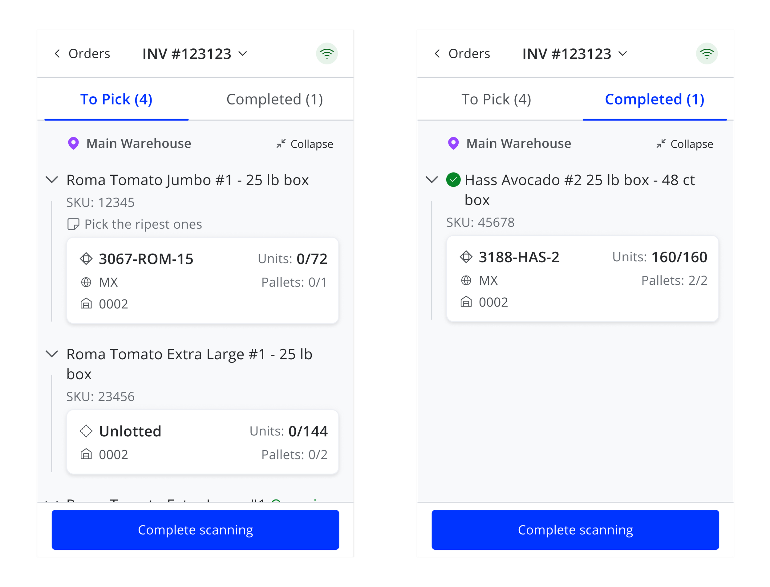
Showing progress by separating items
Some orders have many items to pick and pickers need to see the progress they make while working on an order. We decided to separate items left “to pick” from “completed” items to keep the user focused on what else is left to pick.
Solution
A mobile-first scanning workflow that integrates seamlessly into warehouse operations:
Scan to pick orders: pickers can scan items directly while pulling product.
Immediate inventory update: inventory counts updated as items are picked.
Real-time error handling: immediate feedback if the wrong item/lot is scanned.
Flexible permissions: managers control whether associates can modify orders.
Non-visual feedback: sound cues to alert success or errors.
Impact
The final solution is currently in development and the metrics we plan to collect are:
Time saved when picking orders
Number of mistakes
Number of times an order quantity is edited
Learnings
Balancing limited screen space with the need to display extensive information was a key design challenge throughout the workflow. Additional features down the line will push this challenge further, but we found a balanced system that it will allow this feature to scale with additional information.